Farmhouse Bedroom Paint Colors

Hey friends! If you follow me on Instagram, you'll have seen me take you along today as I chose paint colors for a project I'm doing in our guest room. The awesome people at Sherwin Williams reached out to help me with this project, and it's a perfect fit: I've been using their paint products in my home and for clients for years now! They make my very favorite white EVER, plus the colors are just so thick and creamy. Match made in heaven!
Pictured above are my very favorite farmhouse paint colors that I've ever used for my interiors clients and in my own homes. Let me tell you why!
Alabaster: This is my ride or die white. If you see white in my home, it's this color. The reason I love it so much is that it is literally the perfect balance between cool and warm…meaning it doesn't pull too far into icy, sterile white, nor does it put off yellow pee undertones. If I HAD to pick a direction it leans towards one way or the other, I'd say it's just the tiniest bit on the warm side…which, in my opinion, is just what you want in a farmhouse style home! Cozy white shiplap….ahhhhh. 😍
Sea Salt: This is my very favorite colorful color from Sherwin Williams, and, where there's no Alabaster on my walls, there's Sea Salt!! 😉 This color is perfect if you get bored easily: it shifts and moves between a very muted blue-grey, a pale green-blue, and sometimes just a light grey depending on the natural light, placement of lamps, location of windows, weather forecast, you name it. It's so much fun and just the perfect pop of subtle, pale farmhouse cottage blue/green/grey. It's quickly becoming my signature color, and I think you'd like it as yours, too! 💙
Rain Washed: If you want a real deal pop of cottage farmhouse color, Rain Washed by Sherwin Williams is it! It's like Sea Salt's bubbly, bright, talkative best friend…. 😉 Just a bit more vibrant and saturated, but still in that same blue/green color family.
Light French Grey: After choosing white paint, I'd say the next hardest for me has been finding the right grey/greige color. If you want a cooler, more cement-tone grey, this is it! If you like the tone, but the actual color is too saturated, you can always ask them to lighten it for you! Try lightening by 25-50% for the same tone but less saturation, or find the next swatch up from Light French Grey on the color swatch at Sherwin Williams! Same color tone family. 🙌🏻
Mindful Grey: Okay so if you want your grey/greige to pull just a little bit warmer in undertone, this color is for you! This is truly one of my very favorites of all if you are looking for a neutral grey-beige farmhouse color for your walls!
Let me show you how my top two favorite colors (Alabaster and Sea Salt) work together in my own home, and my Insta Stories paint-picking adventure is recapped below!
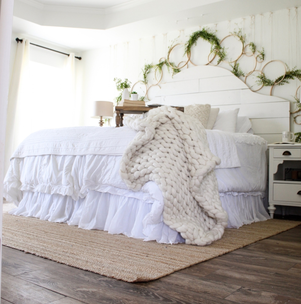
(Walls and shiplap headboard are SW Alabaster…a warm, creamy farmhouse white.)

(SW Alabaster on cabinets against walls of Sea Salt)

(SW Sea Salt on walls…the perfect farmhouse cottage pale blue green…love!)

(SW Sea Salt on the walls and ceiling | SW Alabaster on cabinets, trim, beams, island)
Instagram Stories Paint Picking Recap:
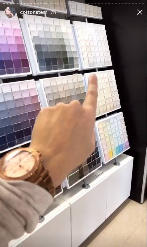
If you missed IG stories and my paint picking adventure with Sherwin Williams, I've screen-grabbed some shots and rounded up the seven main tips I gave to my Insta-buddies! See the recap below!

1. Go Up One
Once you've determined the basic color you want (grey, green, white, etc), and you find your eyes drawn to a specific swatch in that color family, maybe go up one lighter on the swatch card. You certainly can go with the richer color….just remember: you're looking at just a two inch square of that color. Imagine it alllllll over alllllll the walls….is it going to be too much and overwhelm the space? Could you get the same tone/effect by just going one lighter within the same color family? Something to consider if you've ever chosen "the one," put it on the walls….and it was WAY TOO MUCH. 🙋🏻 Been there.
2. Lighten It
A similar tip would be to lighten the color a bit. If you just love a certain color but think it might be too saturated for the space, and you're not wanting to start the paint color search all over again, just ask the paint pros to help by lightening the color anywhere from 25%-50%. This might alter the tone just the ittiest bit, but it won't turn a red into a brown or anything crazy. This is what I do when I want to use one of my signature colors in a space that might need something a bit lighter: I ask the pros to lighten it for me!

3. Know The LRV (Light Reflective Value)
Flip over your paint card and look at the number next to "Light Reflective Value." LRV determines how much light is going to bounce off a certain color, thus how much light is going to be flooded back into the room. This is graded on a scale from 1-100 with a scale of 100 being VERY BRIGHT. Colors up towards 70-90 will really bounce that light back into the room and help things brighten up. Colors with lower LRV tend to sort of absorb the light–this isn't a bad thing at all, especially if you're going for a moody, romantic, cozy space or if your room is filled with natural light anyway. You just need to go to the paint store knowing what kind of lighting you're working with and what kind of mood you're trying to create by adding paint.
The folks at Sherwin Williams explain it best, so here's a link [CLICK HERE] to more info on light and how it affects choosing paint!
4. It's Okay To Be "Boring" 😉
When you first walk into the paint store, all those deep, rich, bright colors really catch your eye. Now, if that's the look you're trying to create, grab 'em up! However, for this soft, neutral farmhouse vibe we're talking about today, don't be ashamed to spend your time over in the snooze section. 😉 All of my favorite colors sort of pale in comparison to their louder counterparts when clumped together on a wall o' paint swatches. But! Pull them off, lay them on their own, and they are just the perfect subtle, neutral tones (see graphic up top!). It's okay to be boring sometimes. 🙌🏻
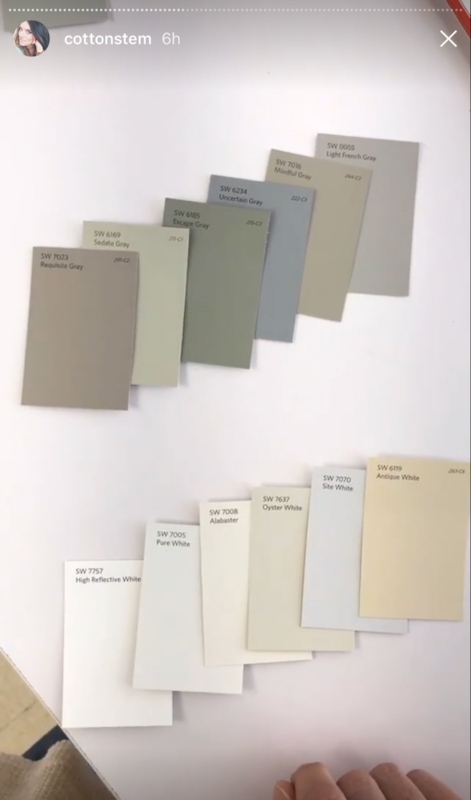
5. To Determine Undertones, Line 'Em Up
Not all colors are created equal, even if they are all called the same name. Ever picked a grey, for instance, and put on the walls to find that it was actually quite purple or green? This can be avoided by laying out swatches all within the color family from which you are interested in choosing, and…suddenly their true colors start to show ("Trolls" on repeat over here…can you guess what's stuck in my head now? DANG IT. 😩) See the image above? Once all grouped together, you can see that one of the greys pulls way blue, one reads pretty green, some are more brown, while the top right is a little more like cement in tone. Same with those whites: look at the top two…so blue and so yellow! This will help as you try to narrow things down within a color family. Line 'em up to let their true colors come through!
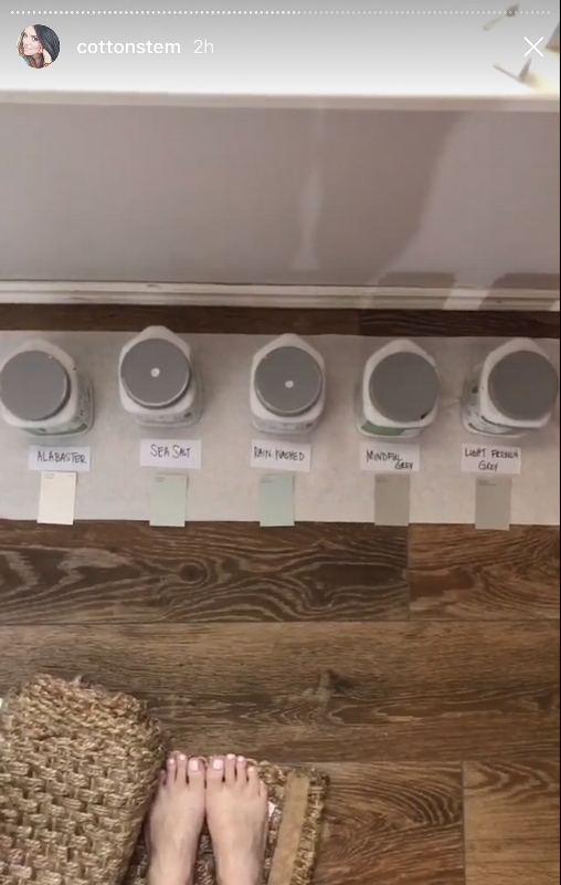
6. SAMPLES SAMPLES SAMPLES!!!
If you only remember one thing from all this paint talk, remember this tip: budget for samples of the colors you THINK you love. In my opinion (and from learning the hard way….multiples times 😩😂), it's much better to "waste" money on a few sample pints than pick a color, spend $50-100ish and lots of man hours to paint….and then realize you hate the color. SAMPLES FIRST!!! I like to narrow things down to four or five choices within the color family I'm interested in, and then I use money from the paint budget to bring home samples. Which leads me to the next step….


7. I Like Big Swatches And I Cannot Lie
Now that you have your samples back home, slap up BIG swatches on ALL of the walls in the space, preferably keeping the different colors running in the same order on each wall so you can keep track. Don't be intimidated by this step: you're going to paint those walls anyway, and, if you're using a quality paint, you won't be able to tell there ever existed swatches! Live with those swatches for a few days. Pay attention to the colors at different times of the day, with the lamps/overhead lights on and off, when the weather is sunny or stormy, etc. Usually after I live with the swatches for a bit, it's quite clear which one is going to make the cut. Steps 6 and 7 are my foolproof method for picking the correct color, and I highly recommend swatching for all you're worth!! 😉
Hope my top five favorite farmhouse paint colors and seven paint-picking tips might give you some color inspo/guidance for your own home! Tell me…any favorite paint colors I should check out?!? I'd love for you to stop by on Pinterest and say hello, and, if you can catch it, check out my Instagram stories from today where I take you to Sherwin Williams and chat more about the above steps! 💗 Hugs, buddies!
SOURCES:

Farmhouse Bedroom Paint Colors
Source: https://cottonstem.com/2017410top-5-farmhouse-paint-colors/
